Helping customers experience the benefits of owning a Tesla
Tesla
- Art direction
- User Experience design
- User Interface design
- Motion design

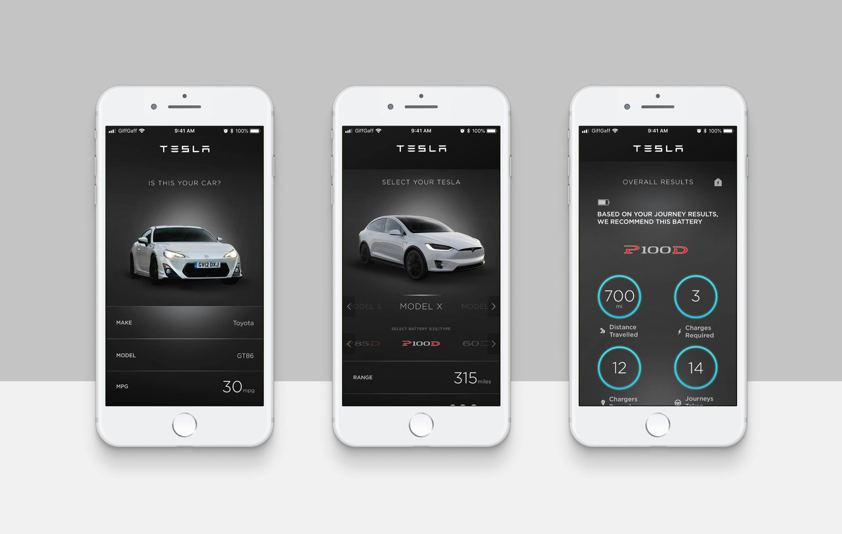
Tesla’s brief was to produce an engaging way to relieve ‘range anxiety’ - the worry that you might run out of charge during your journey. The app was designed to be used in your existing vehicle, tracking your journeys to calculate how much charge you would have used if you had completed that journey in a Tesla.
Worked on as part of Edelman
I was the lead senior designer for this project whilst working for Edelman UK, which involved creating the concept, a user journey, how it would work and the visual design and interaction of the application.

Measuring your current journey range against electric range
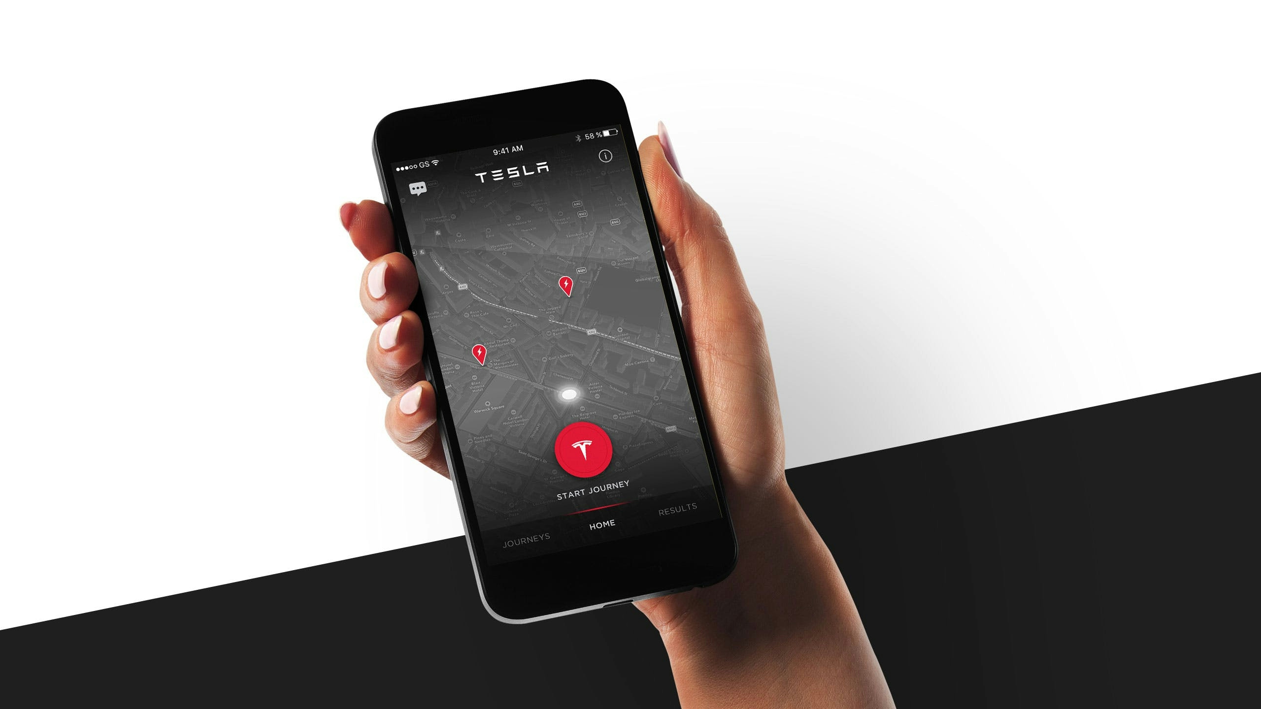
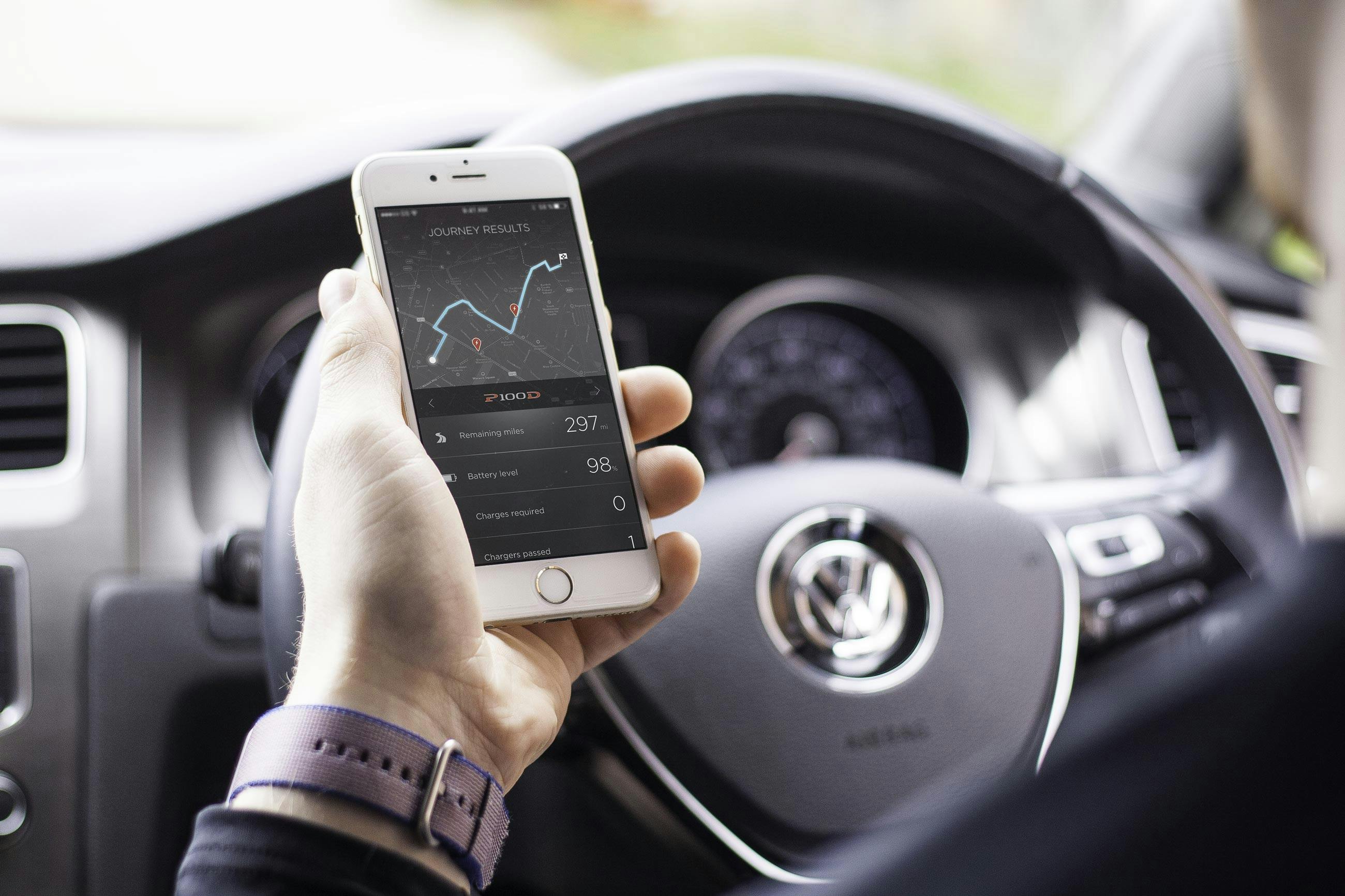
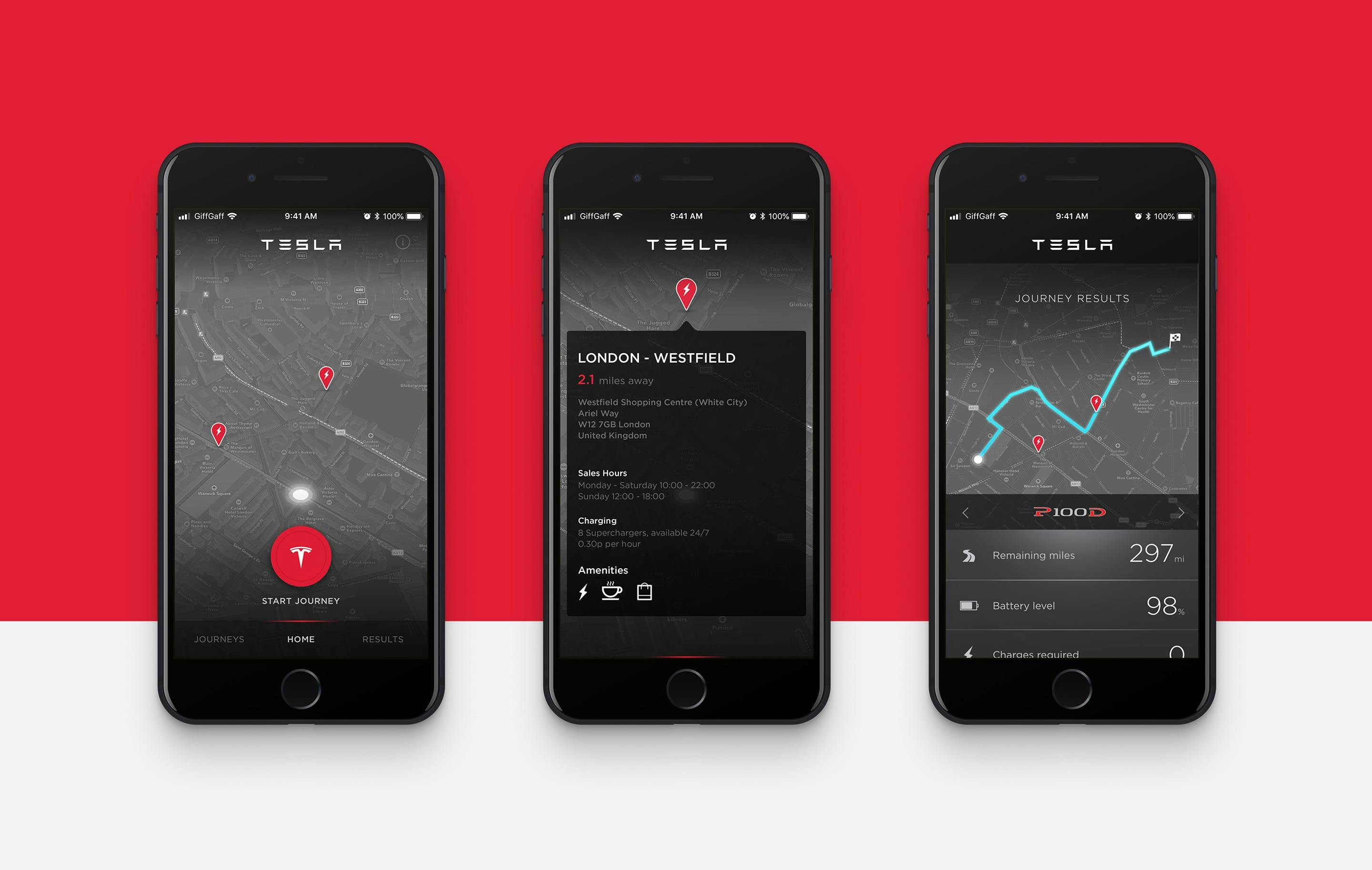
The app would track your journey in your existing petrol car using GPS, at the end of the journey you would receive the results which would show you how much battery you would have used and have remaining had you been driving a Tesla, how many chargers you passed and how much money you would save compared to that journey using a petrol car.
Over time, the app would build up data to show you how much battery you would use on your regular journeys, giving you an idea of how a Tesla might suit your lifestyle. Each journey would display electric chargers on route to to help build that reassurance that you are never too far away from a charging point.


The app was rolled out initially via Tesla dealerships in the US to potential customer who were looking to purchase a Tesla, but not quite 100% convinced it was the right time to purchase an electric car.